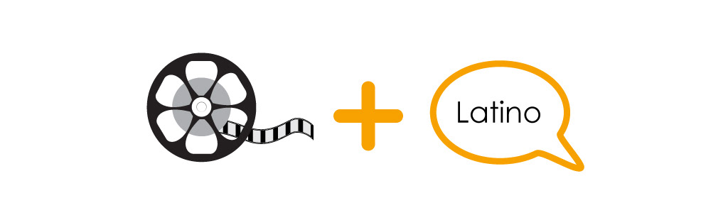
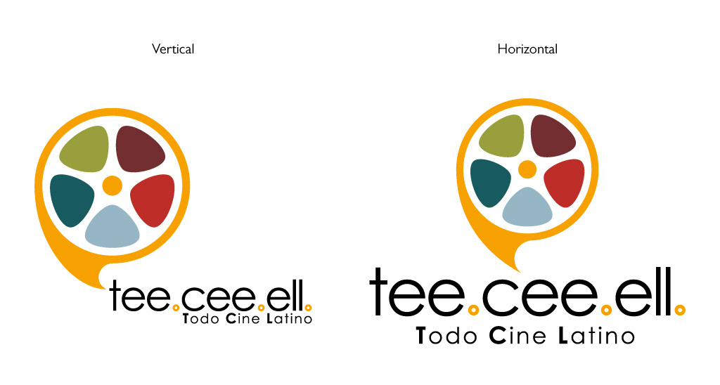
I started from the most basic element that describes the company the best, movies (a reel) and Spanish speaking (talking bubble).
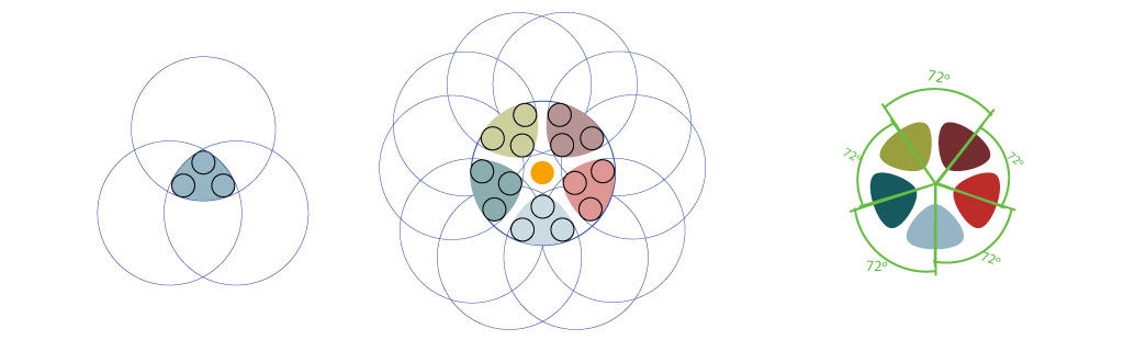
I designed a geometrical harmonic movie reel in negative. The reason of this is using different colors in each hole to represent the variety of countries and ethnicities that speak Spanish.

I designed the talking bubble and exterior part of the real based in perfect geometrical circumferences. I designed two version (vertical&horizontal). In the vertical the circumferences are aligned to a vertical axis. In the horizontal one the circumferences are aligned to an horizontal axis.
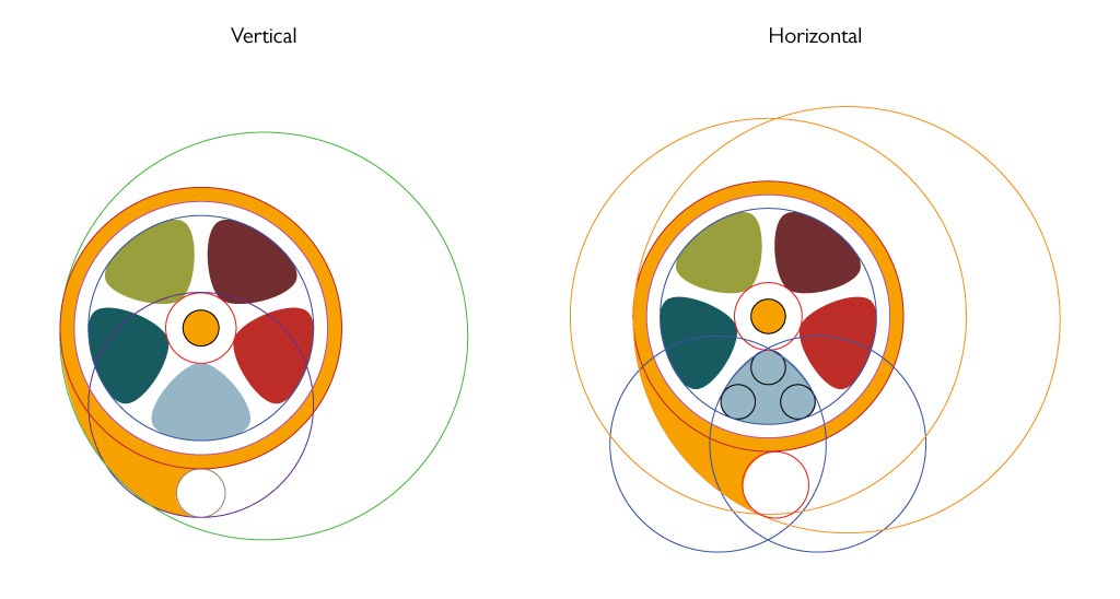
Placing the reel inside of the talking bubble keeps the geometry of the axis.
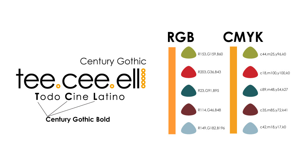
I used Century Gothic as typeface. The colors:
Orange is the sun, one of the colors that best represent the Latino personality.
Green is nature, forest and jungle. Central and South America has plenty of them.
Brown is the earth, soil.
Red is the blood and pasion.
Blue is the sky.
Blue greenish is the ocean and caribean sea.
The idea of mixing all this colors is to describe a character and explain the variety of spanish speaker. It is a language that represents a lot of countries and cultures.
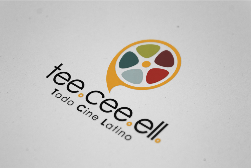
The final product.

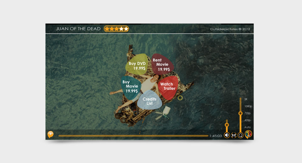
Once I had a solid Corporate Identity, I begun to design the UX elements and the website.